February 24, 2011

A GSO in Honor of Dads!

The Gallery Standout for this week is one that really touched my heart. It's by beckyroy, and she used Sugar Pie Scrap's kit My Love. Not really much to say about this one. Despite the journaling having been X'd out because of it's personal nature, I believe it speaks for itself. Really lovely. Sentimental without being sappy - a hard line to walk.

So congrats! A truly wonderful GSO.


Be sure to click on beckyroy's layout and leave her some gallery love. The image is linked, so one click'll do ya.

And keep posting those layouts. You never know who's will show up here next!

Take care,
Tobi-Dawne.

February 23, 2011

Find Your Balance

Hi everyone Casey here.  I hope everyone is having a great week and enjoying that today is hump day...now the slow descent to another glorious weekend!  Since we normally have a little crafting time on those lovely weekends I thought it was a good idea to go ahead and discuss balance.  If you remember we are going through the design acronym ECBARF.   Thus far we have touched on Emphasis and Contrast...click the links to check those posts.

Balance...ah that elusive state where our lives and check books are in a state of calm and proportion.  Well, there are things we can do to make balance not so elusive...in our scrapping.  Have you ever completed a layout and just thought something was off?  When you looked at it did your eye not snap to the focal point or did your elements and photos look our of place?  Well, there is a chance that the layout could have been out of balance.  I find this the most challenging design element to implement into my layouts.  

So let's discuss what balance means and how to incorporate this principle into scrapping.  First off let's think about balance in terms of you and I.  When we are in balance we can walk, run, function without tipping to one side or falling...well most of us can I seem to be an exception...I'm such a klutz (off point).  With that in mind balance means nearly the exact same thing in scrapping.  A balanced layout is one that is pleasing to the eye and flows well.  

To talk about balance in scrapping one has to think about a couple of different things.  For a more in depth discussion of each one of these topics and for more example layouts please click on over to the Daily-Digi's Balance post.  But for now let's get the Cliffs Notes Version.

I'm afraid that in school I was not the best math student...this extended into algebra and geometry.  So when I first started reading about the X and Y axis in balance I started having flashbacks...but no worries it is not that bad!  I had rather think about balance from the perspective of recess...like in terms of a see-saw.  When two children of equal weigh use a see-saw it is balanced out and works pretty well.  But let's say I get on the see-saw, at 5' 10" and 145 pounds I don't think my see-saw would work so good with say a third grader.  The same olds true for your layouts.  If the layout has more heavily 'weighted' elements, photos, etc to one side or the other the balance is thrown off kilter.  So we have to use our balancing knowledge to distribute the 'weight' of our elements, photos, etc more equally.  There are several ways to do this.  Below is a discussion of the different methods used to incorporate balance and great example layouts using Sugar Pie Scraps products.

Horizontal Balance:  This design by enu0828 is a great layout to demonstrate horizontal balance.  For a moment envision a see-saw under the layout photos and elements.  Do you think the see-saw would work well or would there be one side significantly 'heavier' than the other?  Because the elements and photos have similar sizes and visual 'weight' the layout has horizontal balance.  (Kit:  Thankfulness by SPS)


Vertical Balance_  Vertical balance is identical to horizontal balance...just turn it on it's side.  For instance take a look at greengrrl's Pudding layout.  Imagine the layout sliced down the middle of the element and photo cluster...would you have two equal parts?  Pretty close I think and what a cute layout!      (Kit:  Its Potty Time Girl by SPS)


Radial Balance:  OK how many of you have ever watched the ripple effect...you know where you drop a droplet of water into a pot or sink and it causes ripples to radiate out from the center.  Ahhh...this can happen in scrapping too!  The great thing is it can work for squares and rectangles not just circles. Take a look at lnewhouse's layout IHeartU...imagine the ripple effect...pretty cool huh?  Notice how your eye comes back to the center of the layout and her gorgeous photos...that is balance and emphasis working hand-in-hand. (Kit: My Sugar Pie by SPS)


Alright now we need to talk about the kinds of balance we can use.

Symmetrical:  Back to geometry when something is symmetrical it means that it is the same on both sides.  For example, a circle when folded in half is identical on each side of the crease.  Whether the fold is top to bottom or side to side the outcome is the same...identical halves.  Symmetrical balance is the same.  Look at this layout by SugarPie...again imagine folding the layout...is it symmetrical?  Crystal's elements are weighted similarly, and placed in balance.  (Kit:  Glittery Christmas by SPS)


Asymmetrical:  Now the more tricky topic...asymmetrical balance.  Asymmetrical means that a shape or objet is not the same on both sides.  Remember those really cute dresses and skirts from a few years back...with asymmetrical or handkerchief hems...well that is the idea...they were jagged thus asymmetrical.  How does one use asymmetry to achieve balance?  Take a look at beckroy's layout.  Notice how there is an element cluster in the upper right corner and then her main element and photo cluster.  The distribution of the 'parts' of her layout adds weight to the various elements that brings the layout into balance.  While the upper right cluster is smaller the distance away from the 'main' cluster and the use of whitespace helps add weight and balance.  (Kit:  My Love by SPS)


I hope you are able to take the information in this post and apply it to your layouts.  Until next time...happy scrapping.  Be sure to check in often as I continue this series...next up alignment.


February 17, 2011

A Dog Gone GSO!

Okay, the title of this post is my lame attempt at a little dogged humour. ;) This week my pick for Gallery Standout features the sweetest little canine companion. And who better to choose as your Valentine - a dog's love is never in doubt, and they can be counted upon like no other. So congratulations Shauna, both your Valentine AND your LOs are winners in my book. :D


Shauna's lovely layout is linked, so be sure to click on it and leave her a little gallery love. After all, who doesn't like a little love. :) Shauna used Sugar Pie Scrap's kit entitled "My Love" for her loverly LO.

Keep scrappin' and keep posting. You never know who's LO will catch my eye next. It could be yours.

Take care,
Tobi-Dawne.

February 16, 2011

Contrast...that little something that makes a big difference!

Hi everyone...Casey here with the next installment in my ECBARF series.  Remember that ECBARF is the acronym used to signify the major design concepts we use in scrapping.  Last week we covered E for emphasis so this week we tackle the big C.  C represents contrast...and contrast is the term used to describe how an element stands out against it's surroundings.  Contrast makes certain pieces of a layout pop and adds overall visual interest.  


Contrast is something we have to be careful with...too much and our layouts can become overly busy or confusing to the eye...not enough and we are left boring and blah.  Finding the happy medium takes practice.  So to help you along your digi-scrapping journey I have included several examples of layouts (using SPS digi-kits;) that used contrast well and a description as to how contrast was used.  Oh and don't forget to read a more in-dpeth discussion of contrast you can click on over to the Daily-Digi.  


CrazyKiera used several contrasting methods in this layout.  Notice how her title is done in a more beefy font than her journaling.  This draws the eye to the title and adds visual interest.  Also notice how she has used the lighter white paper for the wave shape.  The shape and color draw the eye and adds a bright splash...contrasting against the darker paper used and the other rectangular shapes.  Last but not least her use of the aqua colored ribbon amidst the element cluster adds a another bright splash of color and a touch more contrast as well.


nof007750 created this cute layout!  Take a look at how creative her title is.  Her use of a different font, font color, and size all add contrast and grab your attention.  This is a great way to add interest...what a cute layout. 


melissavt designed a bright fun layout that is simple yet gorgeous.  She uses contrast by combining a black and white photo with color pics.  This is a great technique when working with multiple images.


shawnbear  created a darling layout using shape contrast.  Notice that her photos are all cropped in rectangular shapes and that the page borders are squares.  Both of these shapes have hard edges/angles and are repeated throughout the layout.  This repetition provides cohesion but she incorporates contrast via the scalloped circle paper.  The eye is immediately drawn to this area and helps you focus on her title and photos.


beckyroy also uses shape contrast.  Notice how she uses the circle in the background with all the other rectangles and squares.  She also uses contrasting colors throughout the layout...but this is not overpowering because she kept busy patterns to a minimum.  She also used the great alpha to grab your attention...the black and yellow lettering really pops when you first look at the layout.

I hope you enjoyed this post and that it helped explain the concept of contrast.  Be sure to keep an eye out for my next post on balance.  Until next time...happy scrapping!

February 14, 2011

Monday Miscellany

I'm going to share something very different with you today. It's not scrap related but it affects my ability to scrap, so it's important to me.

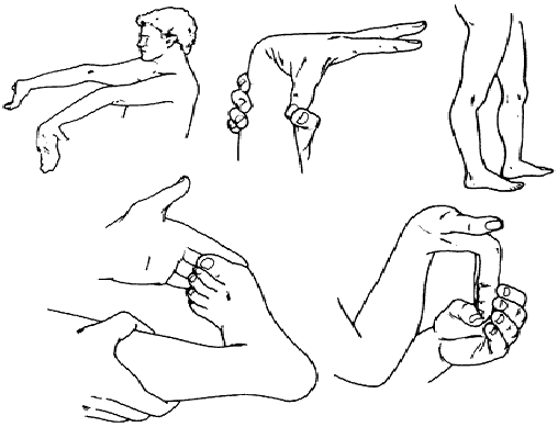
I have Ehlers-Danlos Syndrome Hyper-Mobility type. Now most of you have probably said "what the heck is that"? A few of you may have said "I actually know what that is". For the majority of you, I'm going to share. The easiest way to explain this is my tendons and ligaments act like taffy. Most everyone else's tendons and ligaments act like rubber bands. This means my joints are more likely to dislocate and be out of place. I am a chiropractor's nightmare. If you've ever heard the term "double jointed", it applies to me. People like me are the definition of double-jointed. I have a wider range of motion and the ability to twist my joints and limbs in ways that another person cannot. You know that scratch you can never reach on your back? I can.

I am a recently diagnosed ED patient. If it had not been for my daughter wanting to play basketball, we would have never known that not only did I have ED, but my daughter has it as well. It's good we're both diagnosed. Her early so she can prevent the damage that I've already done to my body. Me, because I now know why I've had certain health issues all my life and always had doctors looking at me like I'm a hypochondriac. I am an atypical patient, in that, I do not show symptoms very easily.

So, how does this affect my scrapping? My finger joints frequently pop out of place. It's pretty painful and frequent mouse usage does not help. My wrist and elbow joints don't usually dislocate but can become painful from overuse of a mouse and laptop. My neck is in a constant state of pain for various reasons. On a good day, I can scrap and be at the computer for most of the day. On a bad one, I'm lucky to be there for one hour.

There are many other “symptoms” I have that affect my daily life, but it would sound like a laundry list for whining if I listed them all here. Now that I’ve shared this with you, I’d like to also share some more information about the disease. There is also a “Spoon Theory” page, I’m going to share because it is very appropriate for someone like me. I hope I’ve been able to share something new with you and maybe helped you gain an understanding of why someone like me who is “always sick” is truly sick and not just “faking it”.

So You Think You Might Have Ehlers-Danlos Syndrome?

But You Don’t Look Sick, The Spoon Theory by Christine Miserandino

February 10, 2011

TD w/a GSO

Tobi-Dawne here with another Gallery Standout!

Now, I know... some might be inclined to complain. You've already seen this layout. But I can't help it if I'm not the only blog hostess who spotted this gem. ;) So you've already seen it, it's worth seeing again. LOL

That said, I'm happy to present you with this weeks GSO.


The image is linked, so be sure to click it and leave sidsymarie some love. After all, we all enjoy getting a little "gallery love" don't we?

Sidsymarie's LO "4 Months" was created using Sugar Pie Scraps' kit "My Sugar Pie", which was inspired by Crystals own little man. A perfect combination!

Well, that's it from me today. :)
Keep scrappin', and keep posting! You never know who's layout I'll snag next.

Scrappily yours,
Tobi-Dawne.

February 9, 2011

Where To Start...When You Are New?


Hi All! 

Casey here a new member of the Blog Team here at SPS.  I am really excited to be here and look forward to sharing various thoughts, tips, and goodies with you.  So let's get started...

When I first started scrapping back in 2009 I knew nothing about scrapping or design.  I simply knew that I loved taking photos, I had a brand new baby, and I wanted to preserve our family memories.  So through the magic of the Internet I found digital scrapping.  I had no natural talent or training period so this new hobby was a bit daunting.   So in the back of my mind I thought that this hobby would probably not last...and yet here we are in 2011 and I am more addicted than ever.  So as I thought about a topic for today's post I wondered what would I have wanted to read as a new scrapper...what would have helped me get a good start.  As I do random posts here I will discuss the concepts held in the acronym ECBARF.  You can read an awesome series of articles at The Daily Digi that covers in great depth this topic as well...

The letters stand for Emphasis, Contrast, Balance, Alignment, Repetition, and Flow.  When applied in scrapping each one of these principles can help improve your designs.  So we will tackle the first letter E or Emphasis in this post.  When I sit down to do a layout I normally have the goal of telling a story...how I relate that story is the fun part...what do I want to emphasize in order to really make the layout pop and make my story come alive?  Normally I emphasize either my photos, title, or journaling...the three main components of most layouts.  Take a look at these example layouts made with SPS digital kits.  And read more about how to add emphasis at the Daily Digi.

Title Emphasis--Notice how sidsymarie uses a large title and bold color to allow her title to pop against the other darker colors of her layout!  And don't forget to look at that little cutie too;)


Journaling Emphasis--Take a look at how lnewhouse focuses your attention to the journaling on this layout.  Her use of the adorable red heart and wrapped text is wonderful.  By the way her photos are WOW too!


Photo Emphasis--Penny's layout is an awesome example of how to emphasize your photo(s). Your eye is immediately drawn to her large photo and the simple embellishments and journaling make this layout beautiful.


I hope that you enjoyed this post and be on the look out for the next post where we will talk about C...Contrast.  Until then happy scrapping!

February 8, 2011

Contest Reminder!


Howdy! This is Kerin here your blog hostess of the day!

I'd just like to quickly remind everyone of the awesome February Challenge!

Since it is February the month of Valentine's day and the air is filled with love, your challenge is to scrap about someone you love! If you'd like to use one of your Sugar Pie Scrap kits that would be great, but it isn't a requirement. You must scrap about a person and you must include a photo of the person. When Crystal first told you about the new February Challenge she reminded you about her awesome "My Love" kit, but don't forget she also has the super cute "My Sugar Pie" kit which would also be perfect for this challenge, but again it isn't a requirement. You can get them both over at Polka Dot Plum.

For inspiration, here are some layouts that the Sugar Pie Chefs have been busy working up over in the kitchen!


To enter, simply upload your entry to a gallery and post the link to it below in a comment. All entries must be received no later than 12:00am EST (midnight) on Monday, February 21st. The winner will be announced on Tuesday, the 22nd.

I personally cannot wait to see what everyone cooks up! I'll see you all next Tuesday take care.

-Kerin,
Blog Team

February 7, 2011

Monday Miscellany

Hi! My name is Dj and I am your hostess for today. Mondays are kind of a grab bag around here. You never know what you're going to get when you stop in! Since I am a "hostess", I decided to share a little recipe with you today.

The recipe I'm sharing is called Spicy Beans and Short Rib Stew. It's kind of a long name, but this is what it was called in the Good Housekeeping magazine it came from in the 1980s. Yes, it really is that old. My mom tore the recipe out of the magazine back then and it has been a family favorite ever since. One of these days I may even get a picture of the original recipe and scrap it as a keepsake.

Without further ado, here is the recipe, complete with my up-to-date changes.

Spicy Beans and Short Rib Stew
(from Good Housekeeping Magazine circa 1980)

1 pkg (16 oz) dry pink beans (I use 2 cans of pink beans)
3 tbsp oil
3 lbs beef chuck short ribs (I buy a roast and cut it into pieces)
2 tbsp chili powder
5 tsp sugar
4 tsp salt
1/2 tsp pepper
1 lb small white onion
1 cup tomato juice
1/4 cup cider vinegar
Water

About 4 1/2 hours before serving: Rinse beans in running cold water and discard any stones or shriveled beans. In 8-quart Dutch oven or saucepot over high heat,heat beans and 8 cups water to boiling; cook three minutes. Remove from heat; cover and let stand one hour. Drain and rinse beans; set aside. In same pot over medium-high heat, in hot salad oil, cook beef short ribs, a few pieces at a time, until browned on all sides, remove short ribs to large bowl as they brown. Spoon off fat remaining in Dutch oven. Return beans and short ribs to Dutch oven; add remaining ingredients. Cook on high heat until done. Serve with rice and cornbread.

My variations: I cook this in a crockpot on low all day. I brown the meat and place it in the crockpot with all the other ingredients. I drain the canned beans, but it's probably not necessary. I adjust the amount of chili powder, my kids aren't too keen on spicy foods.

February 4, 2011

New Release: My Sugar Pie & Grand Opening Sale

I cannot believe it's already February. Time sure does fly since I've gotten older. I can remember being little and it seemed like it took forever for months to go by. I guess that means I'm getting old LOL. Everyone knows that the month of February is all about LOVE! Valentine's Day is right around the corner and I have a brand new kit for you to celebrate the "Little Man" in your life!

I don't know how many of you know this, but I have an adorable son named Landen. I have always called him Mommy's Sugar Pie...which is where I came up with my design name "Sugar Pie Scraps", because my Sugar Pie is my inspiration for scrapping. My Sugar Pie will be 2.5 on Valentine's Day and in honor of him I have created a fun, doodley, kid/boy friendly Valentine's kit. I am very proud of this kit because I actually made some of the doodles myself. I wanted it to be more boy oriented with no pink & purples...so I bring you "My Sugar Pie". You can get this kit at Polka Dot Plum & also at my brand new store opening today at Scrapable! The kit is 30% thru next Friday! Make sure you keep checking back at my Scrapable store. I will be adding more products throughout the week and they will all be 30% off!


Because this was in honor of my Sugar Pie I couldn't resist doing a layout to show him off. So I introduce you to my Sugar Pie, Landen!


Here is some more inspiration from my fabulous Creative Team!


If you haven't already heard, my new store is opening today at Scrapable! And of course I can't open a new store without having a Grand Opening Sale for you all! 


Make sure you visit my blog Monday-Friday for daily posting by me & my fab new blog team. Monday is random posts, Tuesday is a challenge, Wednesday will now be new release day, Thursday will be gallery standouts & Friday will be sneak peak day.

February 3, 2011

Gallery Standout!

Hey everyone! TD here with the first ever Sugar Pie Scraps Gallery Standout. I'm actually quite excited about bringing you a GSO (gallery standout) each and every week. Crystal has created some absolutely gorgeous kits, and the LOs in her designer galleries are often just as breathtaking.

For my first pick, I'm going in a different direction than I often do. I'm rarely a fan of the non-photo layout, but this particular LO is one that is so full of charm that it deserves our attention. Wonderful journaling, and a wonderful use of Crystal's Snow, Sledding, and Sweet's kit, earn this week's LO it's place on the GSO wall of fame.


Stop by http://www.polkadotplum.com/gallery/showphoto.php?photo=14270 to leave some gallery love for this wonderful layout.

See you all next Thursday with another great GSO. And keep posting. You never know where I'll find my next pick! It might just be yours.


Tobi-Dawne,
Head Chef of the Sugar Pie Chefs, and proud Blog Hostess.

February 2, 2011

Lovely Sneak Peek

It is hard to believe that February is almost here!  Everyone knows that February is that special month where we celebrate Love! In honor of this special time of year Sugar Pie Scraps has created a great new kit with the Loves in your life in mind!  Full of doodled words, 'Lovely' colors, and gorgeous elements this kit is sure to please.  Be sure to stop back in on Friday when the kit goes on sale!  I know what a tease right....to be continued on Friday!


February 1, 2011

February Challenge & New Store Announcement

I am very excited to announce that my new store is opening this Friday at Scrapable! I can't wait to join the group of talented ladies there. Make sure you check out my store on Friday when I open! There might just be a sale!

I am also very excited to be starting a daily blog post Monday-Friday. I have a new blog team that will be helping me out, Casey, Kerin, DJ & Jessica. I want to have topics that will be of interest to you the reader, so if you have any suggestions, don't hesitate to mention them to me.

The first Tuesday of every month we will have a challenge here on my blog. The last Tuesday in the month, the winner will be announced. The winner will be chosen at random & will receive a $5 coupon to my store!

Since this is the first challenge, I am keeping it simple. It's February which means Valentine's Day & Love. For this challenge I want you to scrap about someone you love. It has to be a person and there has to be a photo. I would love for you to use my products, but it is totally not a requirement. I do have a brand new kit that would be perfect for this challenge. It's called "My Love" and you can get it at PDP now & it will be available at Scrapable on Friday.


Please upload your layouts to a gallery and place a link to your layout in the comments section below. All entries must be received no later than midnight EST on Monday, February 21st. The winner will be announced on February 22nd.

I can't wait to see all of your beautiful layouts! And make sure to check back tomorrow for a sneak peak of Friday's new release.