Showing posts with label Casey. Show all posts

June 14, 2011

Man It Is HOT!

Living in the South you expect hot temperatures...but not this hot this early in the year!  We have been sweltering for the past several weeks and there is no end in sight.  So what does your family do to beat the heat?  My nephew has a kiddie pool that he loves, my daughter and I just stay in the AC, and my husband loves ice cream.  


Hopefully the weather will ease some...but then again I should not complain.  We are very lucky to have avoided all the severe storms that have occurred recently.  But then again asking for suggestions is not complaining...technically:)


So share your beat the heat secrets...trust me I need them!

May 16, 2011

PDP Challenges

Casey here to share a confession...so maybe I don't usually do a lot of site challenges.  But I decided to check out what was going on this month at PDP.  I am glad I did.  Thus far I have three challenges under my digi-belt and am having a great time.  For instance, I was able to pick up a great template and complete a layout in no time thanks to the Template Challenge and Crystal's Plum Pickins' Beautiful Papers and Elements.

Take a look at the layout and the papers and elements...


Be sure to check out the challenge area of the forum, stock up on Sugar Pie goodies, and join in the challenge fun!

May 2, 2011

[inter]National Scrapbook Day Sale

Hey everyone!  Casey popping by to make sure you are aware that May 7th is [inter]National Scrapbook Day!   Every year when this special day rolls around there are tons of sales that we scrapbookers have to take advantage of.  The best one that I have seen yet is Persnickety Prints offer!  Take a look at the details show in their add below.  They are also doing giveaways and have a free kit for us to enjoy!!  So be on the look out for great sales and happenings around digiland!  By the way I have used Persnickety in the past and they are awesome!!


April 25, 2011

Monday Miscellany, Sharing Seger

Good morning everyone, Casey here and I am running late with this post.  So when I thought about a quick post that would actually be something that I wanted to write about I immediately thought about music. My husband treated me to the best concert every on Saturday...Bob Seger!  It was my first time seeing him live and it was AWESOME!!!

So just in case some of you have never heard of him I wanted to share a few of my favorites so you can be exposed to great, old school, Heartland rock and roll!  My ultimate favorite is Against the Wind.  Below is a link to You Tube that has the audio...there is no video...the song pre-dates slick music videos, and MTV.  Some other favorites are Old Time Rock and Roll,  Chances Are  (from the movie Hope Floats...duet with Martina McBride), and a more recent tune Wait for Me (with a real music video).

I encourage you to take a listen...and see if you are like me and love some Seger;)  I hope you have enjoyed Miscellaneous Monday!!  Oh and I am sure that there will be some LOs dedicated to the concert...be sure to let your music find a way in to your scraps too:)

April 18, 2011

Monday Mayhem...Pandora

Hi everyone!  Casey here to share something totally non-scrapbook related.  I am now blessed with DSL Internet.  We had previously used satelite Internet.  The satelite service had several restrictions most annoying of which was upload and download limits per day.  I was forever breaking the quota and being put in the 'Internet penalty box'.  No more!!  

With this new found Internet freedom I am loving YouTube, E-How and Pandora radio.  Today I want to share about Pandora.  This is the best thing sine sliced bread! Being a music lover and having rather eclectic taste this website is right up my alley.  The premise behind Pandora is that it is trainable radio.  In other words you can teach your personalized station what kind of music you prefer and it plays only those songs that fit your profile.  Training is so easy you wither give a song a thumbs up or down.  You are allowed a certain number of skips per session and there are details about each artist and song available.  So I may hear Bob Seger, AC/DC, Steve Miller, Bad Company, or The Four Tops...at any given moment;)

For me this is so much fun...especially while scrapping!  So check it out...it is free, fun, and easy-peasy:)

April 11, 2011

Sneak Peek and Voting Is Still On!!

Happy Monday everyone! Casey here to share some sunshine! Crystal sure made my morning a bit brighter by allowing me to post this Sneak Peek for your ogling pleasure. All those fresh, bright, Springy colors always make me smile...and smiling is what you are going to be doing on Wednesday when she releases this kit...which is very appropriately themed for a certain Holiday that is fast approaching.  (Huge Hint given)


Until Wednesday you will just have to bide your time and maybe enjoy one of the other great products Crystal has waiting for you at her Polka Dot Plum Store.  Sugar Pie Scraps is teeming with gorgeous designs that are sure to help you make your memories look wonderful!  Oh and don't forget to cast your vote for the theme of SPS' Designiversary kit theme...you can do that here.  Take a look at the winning color swatch and the theme choices...have you voted yet?  Until next time...Happy Scrapping:)


April 5, 2011

Grillin' Season Is Here

Hi all!  Casey here to share something totally not scrapbook related.  But hey not everything in life is about scrap-booking...right;)  My husband and I are avid grillers so I am always on the lookout for new ideas and recipes to try.


One of my favorite places to eat out is Red Lobster (for those not familiar this is a seafood place that serves all sorts of fish, shellfish, and they also do steaks and pasta).    Anyway, I think they have the best shrimp scampi on the planet...so when I found this recipe at Food.com I was so excited.  Take a look and just so you know the recipe is rated at 5 out of 5 stars;) 


What you Need
How To Do It
  1. In a medium, non-reactive bowl, combine the olive oil, lemon juice, parsley, garlic, black pepper and crushed red pepper.
  2. Set aside.
  3. Thread thawed shrimp onto skewers and cover with marinade for 30 minutes.
  4. Preheat grill for high heat.
  5. Grill, brushing occasionally with extra marinade, for about 2 to 3 minutes on each side, or until done.
I cannot wait to give this one a try.  If you are a recipe guru leave a comment and link us up to your favorite...I have been needing to expand my culinary repertoire.  Oh and you can read all the comments and see photos of the scampi here at Food.com!

April 4, 2011

Flow...We Made It

Good morning everyone!  We made it...that is we made it through our series on design principles.  This is the last post where we will be dealing with Flow (remember our acronym ECBARF).  I have enjoyed writing this series and hope that something here has helped you in journey to create layouts that you and your family can treasure for years to come.

OK lets jump right in there.  What is flow?  Flow is really the combination of emphasis, contrast, balance, alignment, and repetition.  It is the concept of all these design theories working together to create a layout that captures the eyes, guides it through your designs and to be honest...pleases the eye.  Since we have already touched on each one of the individual theories I thought it might be a good idea to take a layout from the Sugar Pie's PDP Gallery and point out how a layout achieves flow.


Our example is this gem from Ulrikaulrika.  When I saw this in the gallery I was very taken with it. But after thinking about it terms of ECBARF it made the concepts mesh together in my mind.

Emphasis:  In this layout both the title and photo are emphasized.  The size of the photo and the contrasting alpha colors help draw your attention, or emphasizes these 'pieces' of the design.  Also note now Ulrikaulrika's element placement draws additional attention to her photo.

Contrast:  As mentioned in the emphasis section the contrasting alpha colors help catch your eye and add emphasis...see how these two concepts go hand-in-hand.  But that is not the only example of contrast.  Notice how the bright blue paper really sets off the design...it pops behind the photo and against the background paper.  Don't be afraid of color...sometimes that extra splash is all you need to take a layout from good to AWESOME!  Oh and I almost forgot take note of how Ulrikaulrika has combined different fonts for a bit more contrast;)

Balance:  Moving on to balance now.  This layout is weighted to one side but that does not mean that it cannot be balanced.  In fact it is balanced using vertical balance.  Even though the photo is a bit wider than the blue paper block note how the orange asterisk element is used to bring the layout back in to balance.

Alignment:  When you glance at this layout you immediately notice that for the most part it is center aligned.  The journaling, blue paper block, and photo and elements work together to achieve alignment.

Repetition:  Ulrikaulrika uses color and shape repetition in this design.  Both her photo and paper blocks are rectangular.  Her use of stitching on both these peices adds a bit more rectangular shape repetition.  She also repeats element types with the buttons 'securing' the photo to the page.

Flow:  Lets talk about how the eye flows through this layout and why.


  • Z-Flow:  Ulrikaulrika uses a visual triangle to move your eye through her photo by way of the button elements.  This is probably the first thing your eye did when you glanced at the layout.  Don't ask me why...just except it and move on;)  Seriously everything that I have read says that it is a tendency of the eye to follow the triangle.
  • Next you probably picked up on the title of the layout...the colors grab your attention (contrast).  
  • Then your eye drifts lower to the journaling. 
  • Alignment and balance help control how the eye roams too...the key parts of this particular design are constructed in such a way to keep you focused.

I hope this discussion helps some and that if you have read all the posts in this series you are a bit more comfortable with your style, design, and are even more psyched about scrapping!  I'll be back soon with more tips, tricks, and some great Sneak Peeks;)  And don't forget to cast your vote on the Designiversary Kit contest!  Here is a quick look at the color swatches you can vote on!


Build, Destroy, Repeat Collab by Sugar Pie Scraps & Connie Prince

March 25, 2011

Spring Freebie!!


Hi all!  Casey again :)  I have some great news I had to drop back by and share...Crystal has a freebie and a special sale she wanted me to share with you!  Sugar Pie Chef Guest Mira created a great stacked paper freebie using Spring Is In the Air...take a look at the preview below!  You can download here.   And to make a freebie even better Spring Is In the Air is on sale through Sunday for 20% off...so why not shop a little and start the weekend off right?


Repetition...Sometimes Repeating Yourself Is A Good Thing

Hi everyone...Casey back again to pick back up on our design principles blog series.  We are now on R of the ECBARF acronym.  R stands for repetition.  If you are like me you find yourself repeating what you say way too much...whether it is No to the little one or just about anything to the husband I repeat...a lot.  While this is rather aggravating in conversations it is a unifying principle in scrapbook design.  Repetition of shapes, colors, lines and the like in layouts help provide a cohesive appearance.

There are several ways to incorporate repetition into layouts.  You can repeat shapes, colors, elements, and even motif.  Take a look at how scrappers have used Sugar Pie Scraps designs to create layouts that use repetition...


Ok lets look at this layout from lnewhouse.  Notice how the blue color is repeated numerous times but there are lots of other colors mixed in too to break the repetition up a bit.  The blue tone is repeated in the alpha, elements and papers and yet is not overpowering or boring.  Notice also how the green button, red paper punch, and blue paper punch are repeated...creating several visual triangles that lead the eye and also provide unity via repetition!  What a great layout that showcases Sugar Pie and Connie Prince's great collab Build, Destroy, Repeat.


Moving on to this lovely layout from Bobbie76.  Look at how she repeats the purple hues but also adds hints of green so the purples are not overpowering or like we said earlier...boring.  She has also used several rectangles providing shape repetition. Check out the five paper rectangles...some are narrow, some are wider.  Her ribbons give two more and then three rectangular photos and three rectangular frames.  Wow that is a lot of shape repetition but doesn't it look great!!  Also check out how she uses the purple flowers...all this works together to create one beautiful finished product!  


From purple girlie to bright and boyish!  nof007750 also creates awesome layouts that use the design theory of repetition.  Take this this one for example.  Note her repetition of orange and yellow...the striped paper, blocks and ribbon.  There is also shape repetition present...her shape of choice was also the rectangle...her photo, title paper, striped bottom paper, blue background paper, and the green and orange blocks are all examples of shape repetition.  The angles are different for some elements but the shape is the same...pretty crafty...muwhahaha!


OK lets talk about one more type of repetition...thematic or motif.  This can be achieved by using elements and colors that correspond with the subject you are scrapping.  For this lets look at beckyroy's layout Hunter's First Snow.  Her photos of the little one out in the snow are awesome and notice how she continues that cold outside theme with the heavy coat, mitten, hat, and snow flake elements.  This use of theme or motif is also repetition...not overpowering...but way awesome!  She also repeats shapes via her photos and the color scheme repeats the brown and blue tone with splashes of yellow.  A beautiful layout that is another great example of repetition and Sugar Pie Scraps awesome products.  

To read a more in depth discussion of repetition in design be sure to check out the Digi Files blog.  And to see the products used in these layouts and more from Sugar Pie check out her Polka Dot Plum store.  Until next time...happy scrapping!

March 18, 2011

Super Font Finds

Hi everyone Casey here!  I have been super busy the past several days and now my daughter has an ear infection.  With that said I am going to take a break from the design series we have been exploring the past several weeks.  I will pick it back up next week.  So instead of ECBARF lets talk fun...free...fonts!


I love fonts and I love it when I can find them for free!  As I browsed the Sugar Pie Scraps gallery at PDP I was taken by the fun and quirky fonts we choose.  Fonts are sometimes an overlooked design tool.  We think of them simply as a way to title our pages or record our memories as we journal.  But the right font or combination of fonts can be a big boost!  Take a look at the layouts below and notice how fonts add to them.   Under each layout is the name of the font(s) used and links to where you can snag them for free!


Layout by Me

Layout by loridigi


Layout by Bobbie76


Layout by enu0828

Check out more layouts using Sugar Pie Scraps' products here at the PDP Gallery.

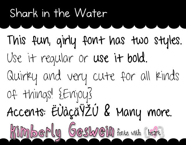
And just because I am in a sharing mood here are three more fonts that I love and find myself using a lot!  Underwood Champion is a nice typewriter font that is great for journaling and subtitles.  Shark in the Water is another great journaling font that I use a lot...since I found it recently;)  And last but not least Impact Label and Impact Label Reversed.  I love to use the Reversed when I put captions 'on' photos.  It gives texture and makes the words really pop!


Impact Label

So the next time you are looking through galleries take note of fonts, track them down and snag them...remember more often than not they are free!  If you have a favorite font leave a comment...we would love to snag your free font find too!!

March 9, 2011

Sneak Peek...Huge News...and A Chance to Win!!


**CONTEST CLOSED**

Hi everyone Casey here with huge, ginormous, monstrous news!  Crystal has been working with *drum roll please* Connie Prince on a brand new collab!  We have to wait until this Friday (3/11) but if the preview is any indication to the awesomeness of this collab it will be well worth the wait!!


Take a look at all those bright colors what a tease this preview is!  Anyway for a chance to win this great new kit just leave a comment here and a winner will be chosen this Friday, "The Grand Reveal Day"!  Be sure to stop back by to get all the gorgeous details!!

More exciting news!! Sugar Pie Scraps was chosen to be the Fresh Face Designer in the March issue of DSA's Enabler Newsletter!!! Sign up to receive the newsletter before the 15th and you will get an exclusive mini-kit!

March 4, 2011

Left, Right, Center...whats the big deal about alignement?


Hi everyone Casey here with another post in the design principles series.  This week we are on A.  A in the ECBARF acronym stands for alignment.  We all know what this means probably.  We use it when we type a letter, position trinkets on a shelf, or stack towels in our linen closets.  Do we want to align things on the left, right, center or justified?  Oh the possibilities.  Well in scrapbooking the principles are pretty much the same.  Let's dig a little deeper...

Alignment has two primary purposes in scrapbooking:  to create order and to create visual connections between elements.  When I first read this over at thedailydigi.com I was rather confused.  I wondered how alignment choices could create any of these things.  I had always thought that alignment was something that only came into play when typing journaling...not placing elements or photos.  But after considering the rest of the article it made much more sense.  


When thinking about alignment it is helpful to establish a 'hard line'.  A 'hard line' is one that is emphasized strongly via your placement of photos, elements, journaling, etc.  In my Moments in the Car layout notice that the strongest or most defined line is the one to the left of the large photo. Almost every piece of my layout is matched to that line.   While it is the 'strongest' it is not the only alignment line present.  Notice how each of the paper blocks are aligned in a grid pattern and how I left aligned my text to correspond with the initial 'hard' line.

OK so establishing a conscious line that you want to emphasize is important when setting up your alignment scheme...but how does alignment create visual connections and order?  Here is where we get a little deep.  Alignment helps define whitespace.  Whitespace is the area or areas of our layouts that are not occupied by photos or elements.  So in my layout there is quite a bit of whitespace...it just happens to be white this time;)  Now look at the second graphic with the alignment lines shown...see how they almost mark off the whitespace regions...almost like margins on a piece of notebook paper.  Thus alignment can help provide structure or order to your design.  A neat way to help you get started on this new path toward alignment is to use ruler guides.  In PSE you can click on the left or upper ruler and drag guides down...these guides are excellent tools to help you build aligned layouts.


Now how to create visual connections between elements?  When elements are arranged with alignment in mind they seem to flow better.  In other words the eye follows a path to each piece of the layout.  Notice how ScrappinDuck used alignment to unify her layout...although the layout is fun and has a free/scattered look if you look closely you can see the alignment lines...your eye follows left to right first and then settles on the center...the adorable photo.  So visual connections were made that pulled you through her design.  

There are lots of different alignment types you can use centered, horizontal, vertical, and various combinations.  Remember that you can start anywhere on your layout...don't be tempted to always start in the center.  Below are a few more examples of layouts that use alignment to create gorgeous unified layouts.  Oh and by the way they also use Sugar Pie Scraps' products;)


Scrapper:  beckyroy


Sugar Pie Scraps' Product:  My Love Kit


Scrapper:  Kristi8004
Layout: Sledding
Sugar Pie Scraps' Product:  Snow Sledding & Sweets Kit


Scrapper:  vwesley
Layout:  Waiting for Christmas
Sugar Pie Scraps' Product:  Glittery Christmas Kit
    
Scrapper:  tomosia
Layout:  Loyal
Sugar Pie Scraps' Product:  My Love Kit

One caution though...don't be so caught up in trying to use alignment that your design becomes too rigid.  It is OK to break alignment when you want...as long as it pleases the eye and makes you happy!  Remember that at the end of the day technical designs theory is a good foundation but our main purpose as scrappers is to capture moments...so don't let alignment stress you.  Keep scrapping and all these fun things will come...in time and with practice.  Here is some homework...browse galleries look at how other scrappers are using alignment and maybe scrap-lift a layout.  You might find that incorporating this design principle is easier than you think.  For a more in depth discussion of alignment be sure to check out Debbie Hodge's great article over at the dailydigi.com.

February 23, 2011

Find Your Balance

Hi everyone Casey here.  I hope everyone is having a great week and enjoying that today is hump day...now the slow descent to another glorious weekend!  Since we normally have a little crafting time on those lovely weekends I thought it was a good idea to go ahead and discuss balance.  If you remember we are going through the design acronym ECBARF.   Thus far we have touched on Emphasis and Contrast...click the links to check those posts.

Balance...ah that elusive state where our lives and check books are in a state of calm and proportion.  Well, there are things we can do to make balance not so elusive...in our scrapping.  Have you ever completed a layout and just thought something was off?  When you looked at it did your eye not snap to the focal point or did your elements and photos look our of place?  Well, there is a chance that the layout could have been out of balance.  I find this the most challenging design element to implement into my layouts.  

So let's discuss what balance means and how to incorporate this principle into scrapping.  First off let's think about balance in terms of you and I.  When we are in balance we can walk, run, function without tipping to one side or falling...well most of us can I seem to be an exception...I'm such a klutz (off point).  With that in mind balance means nearly the exact same thing in scrapping.  A balanced layout is one that is pleasing to the eye and flows well.  

To talk about balance in scrapping one has to think about a couple of different things.  For a more in depth discussion of each one of these topics and for more example layouts please click on over to the Daily-Digi's Balance post.  But for now let's get the Cliffs Notes Version.

I'm afraid that in school I was not the best math student...this extended into algebra and geometry.  So when I first started reading about the X and Y axis in balance I started having flashbacks...but no worries it is not that bad!  I had rather think about balance from the perspective of recess...like in terms of a see-saw.  When two children of equal weigh use a see-saw it is balanced out and works pretty well.  But let's say I get on the see-saw, at 5' 10" and 145 pounds I don't think my see-saw would work so good with say a third grader.  The same olds true for your layouts.  If the layout has more heavily 'weighted' elements, photos, etc to one side or the other the balance is thrown off kilter.  So we have to use our balancing knowledge to distribute the 'weight' of our elements, photos, etc more equally.  There are several ways to do this.  Below is a discussion of the different methods used to incorporate balance and great example layouts using Sugar Pie Scraps products.

Horizontal Balance:  This design by enu0828 is a great layout to demonstrate horizontal balance.  For a moment envision a see-saw under the layout photos and elements.  Do you think the see-saw would work well or would there be one side significantly 'heavier' than the other?  Because the elements and photos have similar sizes and visual 'weight' the layout has horizontal balance.  (Kit:  Thankfulness by SPS)


Vertical Balance_  Vertical balance is identical to horizontal balance...just turn it on it's side.  For instance take a look at greengrrl's Pudding layout.  Imagine the layout sliced down the middle of the element and photo cluster...would you have two equal parts?  Pretty close I think and what a cute layout!      (Kit:  Its Potty Time Girl by SPS)


Radial Balance:  OK how many of you have ever watched the ripple effect...you know where you drop a droplet of water into a pot or sink and it causes ripples to radiate out from the center.  Ahhh...this can happen in scrapping too!  The great thing is it can work for squares and rectangles not just circles. Take a look at lnewhouse's layout IHeartU...imagine the ripple effect...pretty cool huh?  Notice how your eye comes back to the center of the layout and her gorgeous photos...that is balance and emphasis working hand-in-hand. (Kit: My Sugar Pie by SPS)


Alright now we need to talk about the kinds of balance we can use.

Symmetrical:  Back to geometry when something is symmetrical it means that it is the same on both sides.  For example, a circle when folded in half is identical on each side of the crease.  Whether the fold is top to bottom or side to side the outcome is the same...identical halves.  Symmetrical balance is the same.  Look at this layout by SugarPie...again imagine folding the layout...is it symmetrical?  Crystal's elements are weighted similarly, and placed in balance.  (Kit:  Glittery Christmas by SPS)


Asymmetrical:  Now the more tricky topic...asymmetrical balance.  Asymmetrical means that a shape or objet is not the same on both sides.  Remember those really cute dresses and skirts from a few years back...with asymmetrical or handkerchief hems...well that is the idea...they were jagged thus asymmetrical.  How does one use asymmetry to achieve balance?  Take a look at beckroy's layout.  Notice how there is an element cluster in the upper right corner and then her main element and photo cluster.  The distribution of the 'parts' of her layout adds weight to the various elements that brings the layout into balance.  While the upper right cluster is smaller the distance away from the 'main' cluster and the use of whitespace helps add weight and balance.  (Kit:  My Love by SPS)


I hope you are able to take the information in this post and apply it to your layouts.  Until next time...happy scrapping.  Be sure to check in often as I continue this series...next up alignment.